The value of Data Visualizations
Humans and visualizations
Humans are visual creatures and absorb information easier with the help of visual representations in order to better learn and understand concepts as well as to interpret data. Nowadays, the amount of data collected in every domain is growing rapidly. The analysis of this vast amount of data in their plain form, from which one can try to detect relationships, anomalies and inefficiencies hidden in patterns, and in general gain valuable knowledge would be tremendously time-consuming and probably ineffective without the advantage of using visualizations. Data visualizations combine a variety of charts, graphs, and illustrations with reading text to depict information, as well as curate and accurately represent complex data. The main purpose of visualizations is to help the storytelling, removing noise and highlighting useful information, and to assist the viewer to comprehend information, examine the data, derive conclusions, and make decisions.
How to visualize data?
Due to the overwhelming velocity and volume of incoming data streams, there are many cases in which a visual layer of abstraction [1] is needed to assist in data comprehension and decision-making processes. Consider that not every kind of visualizations fits every data type, so in order for data to be effectively and correctly interpreted, choosing the appropriate visualizations plays a great role. What may be considered as appropriate types of visualizations depends on many different variables, such as the nature and the amount of the data, the objectives of the analysis and the expertise of the user. In most cases, it is the linkages among data that convey information and not the data itself. Balancing between form and function sets a group of visualization techniques effective. We need to consider that balancing the peculiarities and differences of the data along with the prospects that each technique holds in order to reach the best representation, has its own challenges. Hence, an effective visualization could prove to be key in understanding and getting the most out of the data available and by extend to the facilitation of the decision-making process. However, the opposite could happen too, since there are many scenarios that wrong user selections might lead to interfaces that are merely adequate or ineffective if they do nοt use the optimal visualizations.

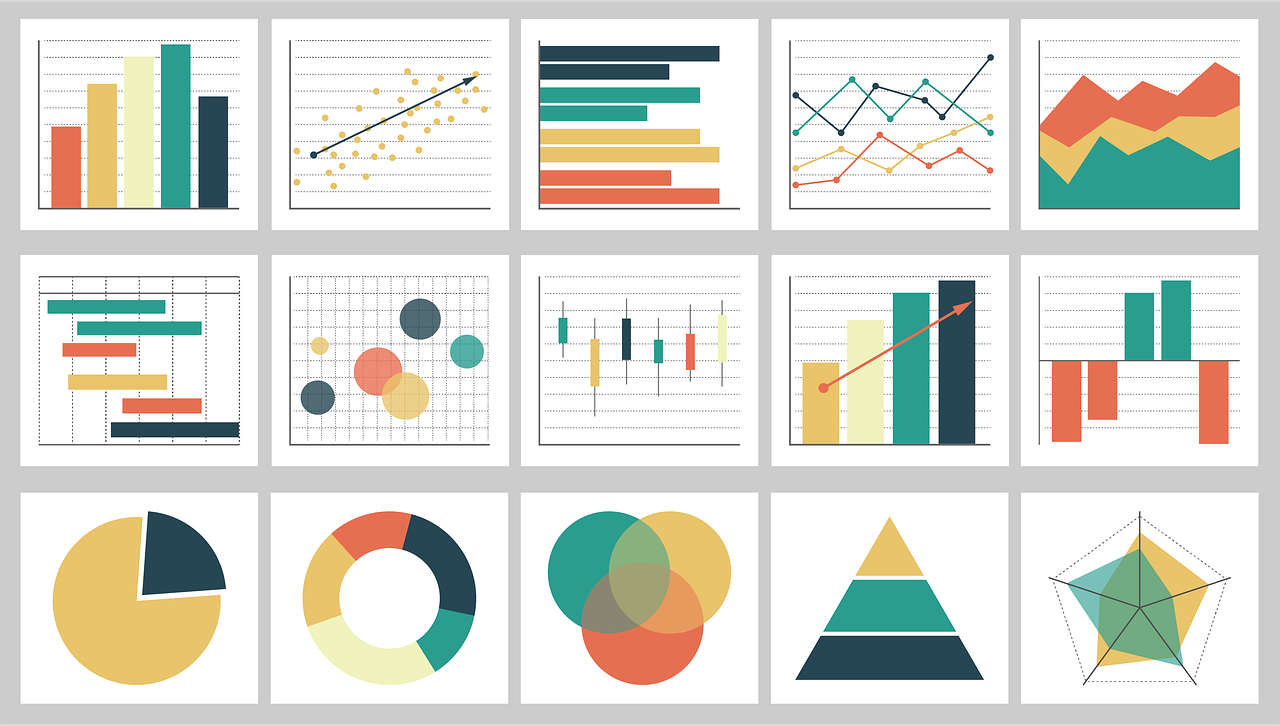
In the figure above, we see how the same data can be presented in different ways and the effectiveness each different technique may have in conveying the insights. Pie charts are one of the most overused graphs and in most cases are not the best way to represent data. In this example using similar colors and having too many slices that can be difficult to read and distinct are setting limitations that can be alleviated with the use of a bar chart. The use of an appropriate color palette and a bar chart allows the viewer to effortlessly distinguish and compare the values of each bar instead of taking time and effort to process the pie chart.
Data visualisation holds many principles and constantly generates new opportunities for future research, which will bear fruit to every business, scientist and individual that will take advantage of it: from governments, finance, marketing, manufacturing, education, to critical infrastructures and so on. Organizations and companies across all these fields that handle huge amount of data from diverse sources, with different particularities, meaning, velocity and type, are urged to cooperate with visualization experts in order to facilitate the communication and knowledge sharing deriving from their analyses. A visualization expert could not only improve the adoption of data-driven knowledge for each stakeholder but also minimize the analysis times, costs, and data-loss scenarios. In parallel, the diversity of data forces the experts to constantly discover new techniques to analyze them in an intuitive way to also expose hidden insights and have meaningful impact.
Which visualisation tools to use?
Nowadays, there are many affordable tools and opportunities for everyone to experiment and translate information into visualizations regardless of his data management or design skills. Although this encouraging fact makes the viewer familiar with data visualizations and confirms their significance, on the other hand, it reinforces the impulse to visualize data without first defining the actual purpose and without taking into account data peculiarities.
Within MARVEL we leverage SmartViz: a visualization toolkit developed by Zelus, which provides a versatile data visualization solution, empowering domain experts and non-experts to discover patterns, behaviors, and correlations of data items. We have tailored it to the needs of MARVEL’s end-users such as city authorities, law enforcement agencies, event managers and more in order to accommodate the visualization need of depicting real-time data, as well as great volumes of multidimensional historical data that come from diverse sources and have different characteristics. The result is the MARVEL Decision Making Toolkit.
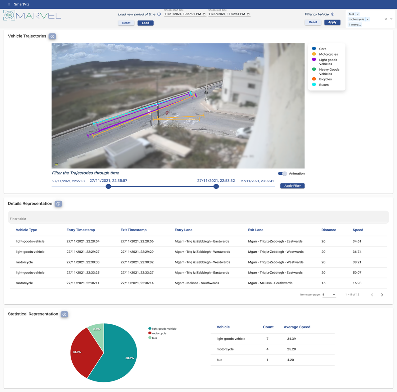
It is meant to assist its users to comprehend vast amounts of data in a glace and use them to have a higher impact on their field such as better planning of road infrastructure in order to enhance green mobility, improvement of traffic within a city, on time interventions at moments of need in crowded areas or prevention of crimes by discovering the areas where they are more prone to happen etc. No matter whether they are experts or not, the MARVEL Decision Making Toolkit is aiming to enable its users to explore information, gain knowledge, support every step of their decision-making process with data and overall improve their activities and achieve their objectives.
[1] In computing, an abstraction layer or abstraction level is a way of hiding the working details of a subsystemSince there is always room for improvement, we would be glad to hear your opinion about our Minimum Viable Product and whether in your view we really achieve our goal. Being an expert or not, is our DMT giving you a good idea of what is happening on a road junction in Malta at a specific point in time? Watch our demo here and let us know. The video includes an overview presentation of the methodology (0:20) and the integration approach followed as well as the demonstration of DMT (18:00).
Feel free to reach out using the MARVEL contact form or to find and talk to us on Twitter and LinkedIn.
Blog signed by: Stella Markopoulou from the ZELUS team
Menu
- Home
- About
- Experimentation
- Knowledge Hub
- ContactResults
- News & Events
- Contact
Funding

This project has received funding from the European Union’s Horizon 2020 Research and Innovation program under grant agreement No 957337. The website reflects only the view of the author(s) and the Commission is not responsible for any use that may be made of the information it contains.